
The Service Availability component represents the first step in integrating BuyViasat into Viasat.com. For now, its sole purpose is to let users see if they can get Viasat Satellite Internet Service in their area.
The Floating Action Button portion is meant to be an ever-present link at the bottom of the page that doesn't get in the way of other content as it follows the user down the page.
The form itself represents the same form fields provided on BuyViasat for users to check if Viasat satellite internet is available in there area. This first phase of the integration allows users to start the process on Viasat.com before resolving to BuyViasat where plans in their area are shown where applicable.
This component has a very specific purpose, language and form fields and if there is a want to use this component in a different way, it will have to be approved by the business and new development will be necessary.
 This screen shows the floating action button's placement on a page. It will be pinned on the page, following the user as they scroll.
 The Service Availability modal overlays the page content, covered by a 50% black veil and is activated once the Floating Action Button is tapped/clicked.
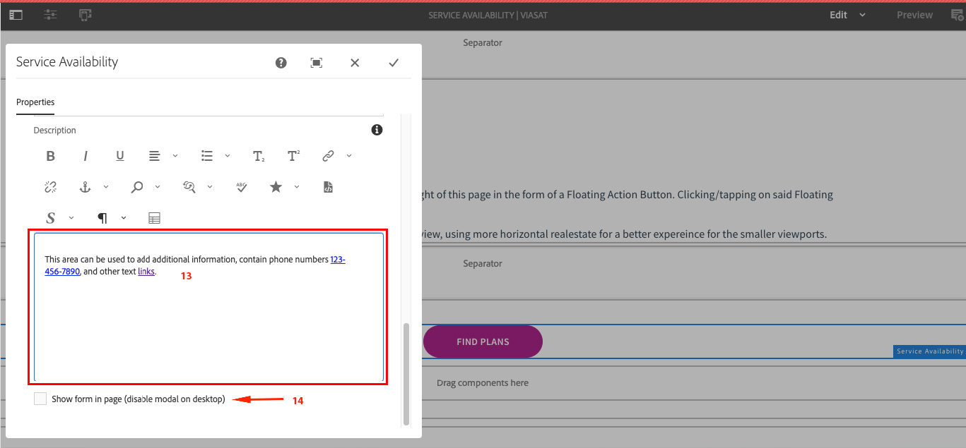
Below are screenshots and authoring notes regarding the authoring of the Service Availability component. Authoring notes are found in red text on the screenshots and below images as captions.
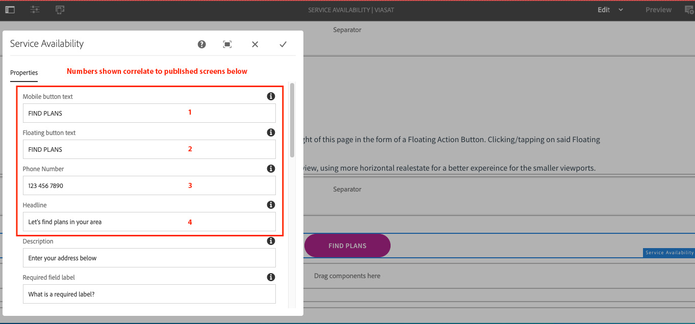
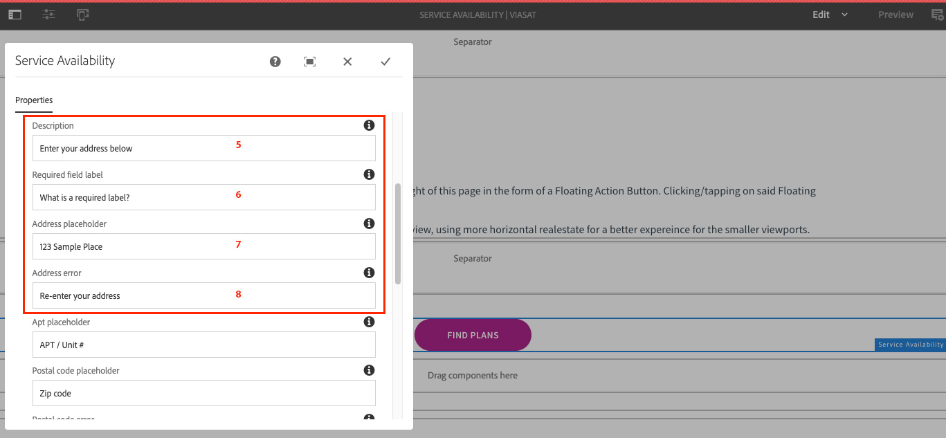
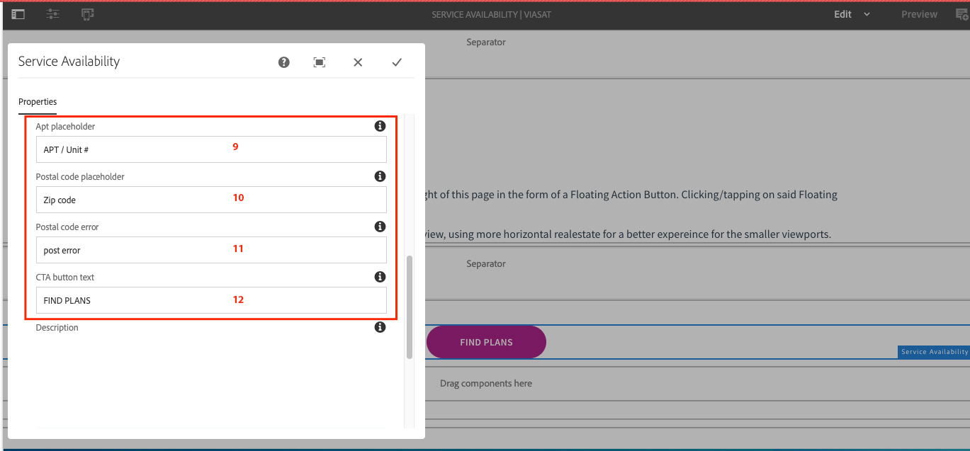
 Drag the Service Availability component onto the page then open settings using the Wrench icon.
 The Floating Pin graphic appears on Desktop. Clicking that opens the form into a modal by default.
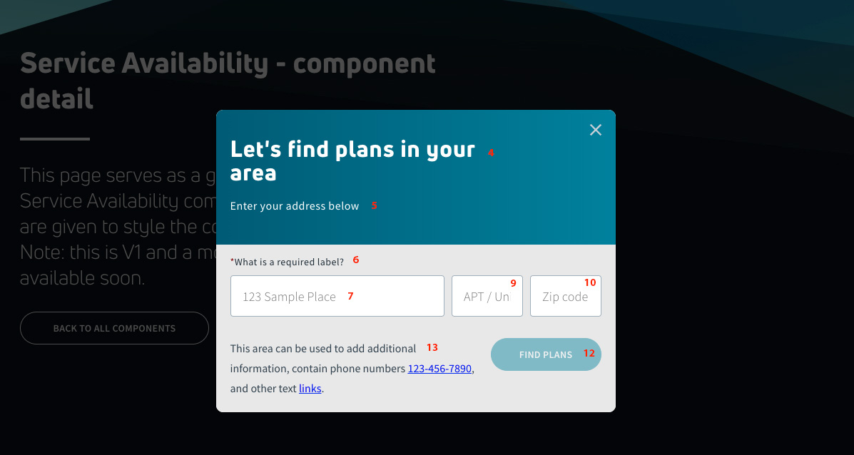 Form shown in Modal opened on wider (Desktop) screen.
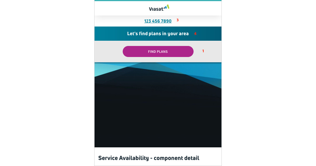 On Mobile (narrow screens) the component appears in the header and is fixed above the page content as you scroll.
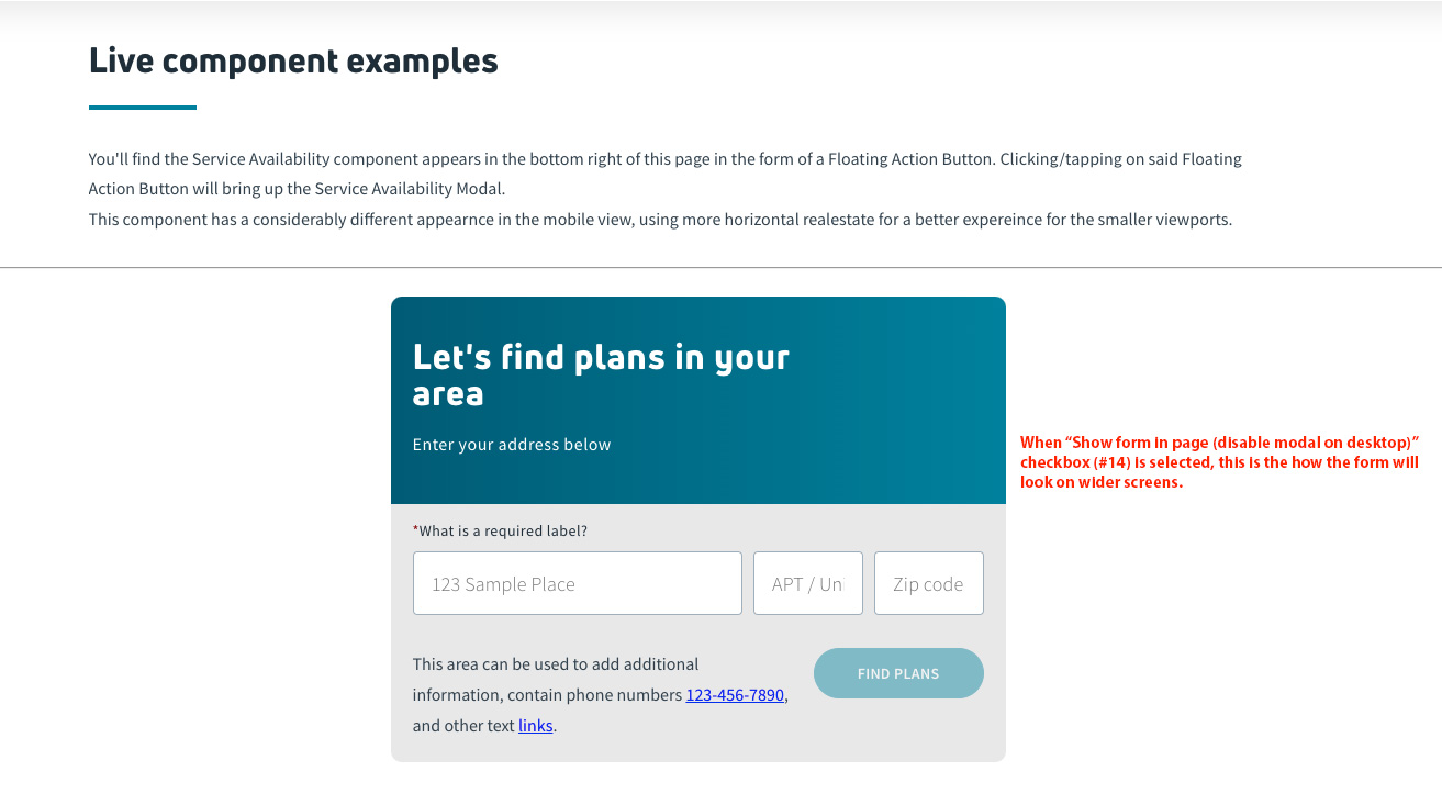 This is how the form looks with the modal option disabled on Desktop. The Form is placed within the contents of the page.
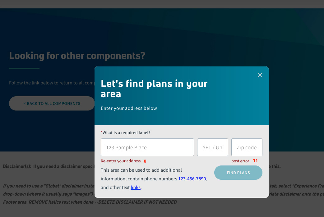 Showing the error / validation text that was entered above.
As mentioned above, the Service Availability component is for a very specific purpose and with that, doesn't have style options that change the look or configuration of the component.
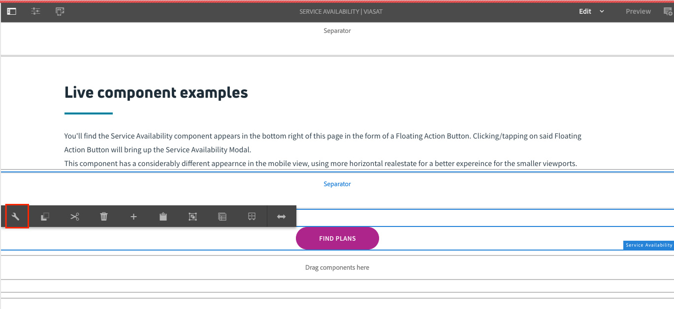
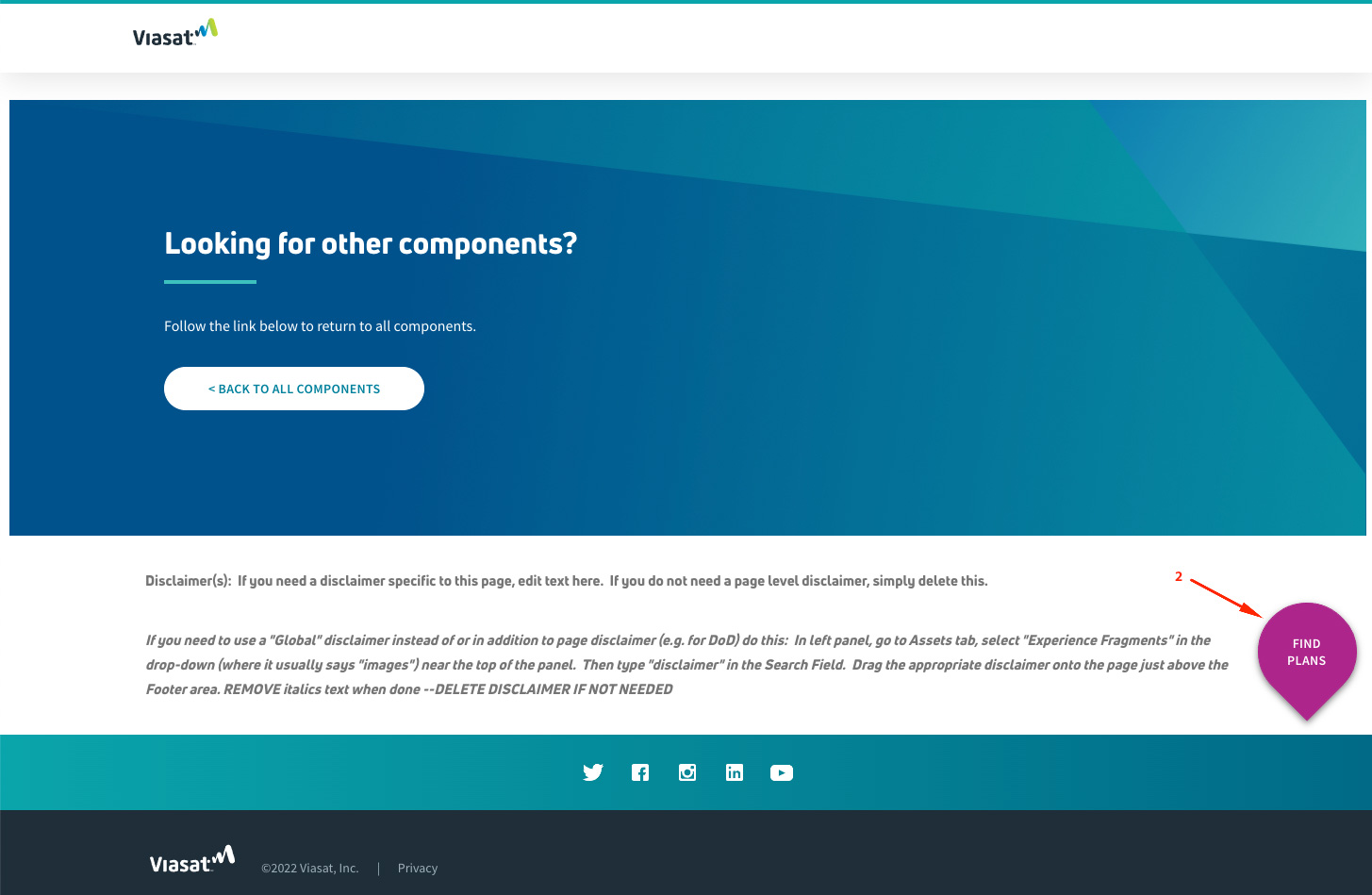
You'll find the Service Availability component appears in the bottom right of this page in the form of a Floating Action Button. Clicking/tapping on said Floating Action Button will bring up the Service Availability Modal.
This component has a considerably different appearnce in the mobile view, using more horizontal real estate for a better expereince for the smaller viewports.
Please do not edit the Live example below.
Follow the link below to return to all components.
