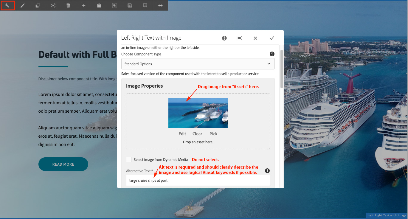
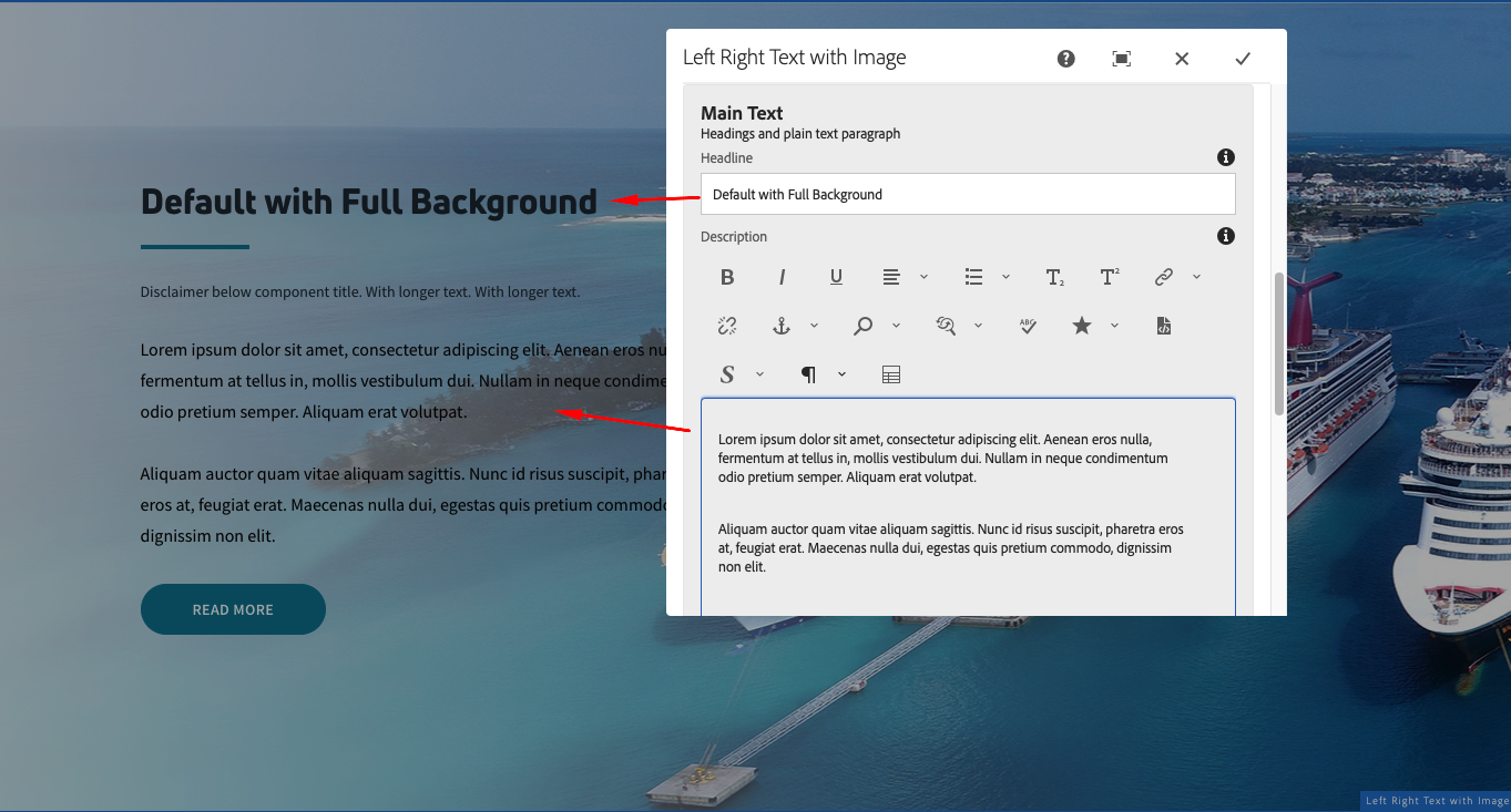
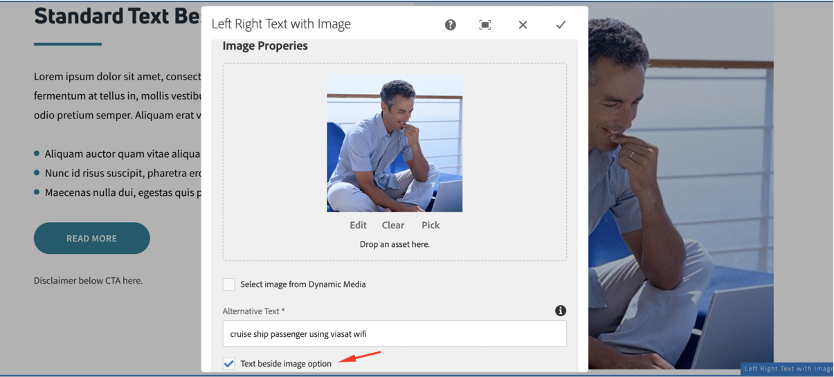
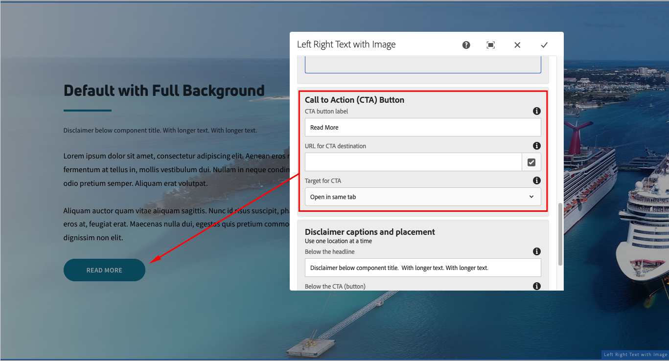
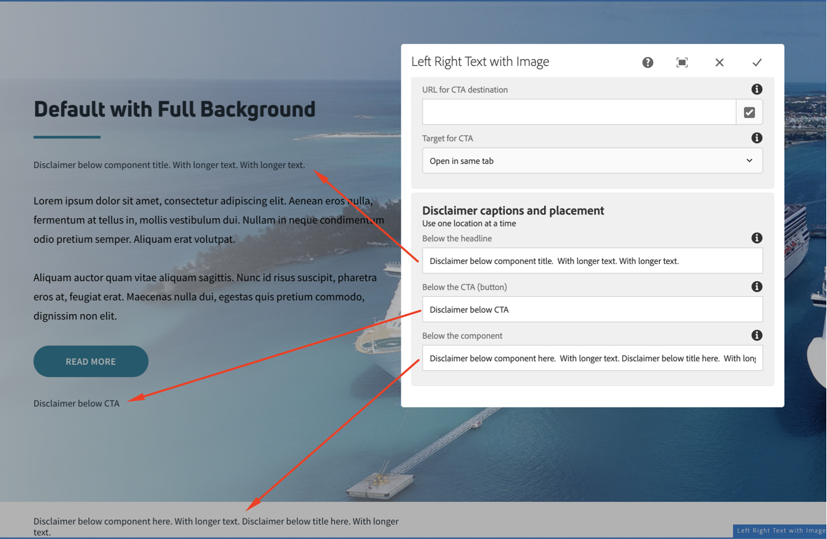
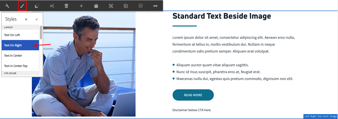
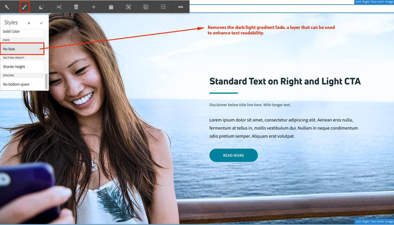
Left Right Text with Image
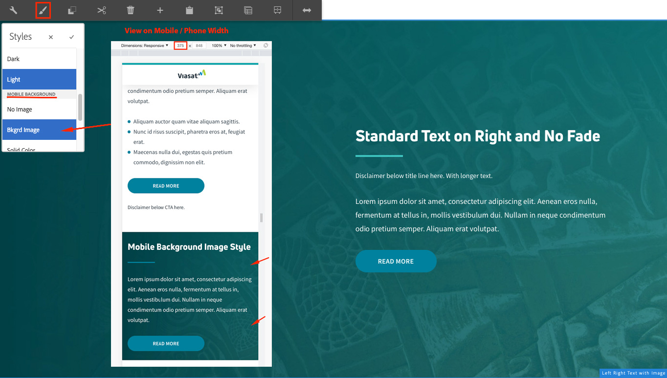
This component is widely used on Viasat.com. It creates a section with an image and companion text. The image may be set to "full" width background with the text on top of it, or the image can be made to sit to the side of the text. The text can be on the left (image right) or on the right (image left) with the side-by-side option.