
Image Crop
This page serves as a guide to understanding Image Crop and how to properly size your assets for mobile and desktop.
This page serves as a guide to understanding Image Crop and how to properly size your assets for mobile and desktop.
The Hero Banner (i.e. Header with Background Gradient) is the main component that needs an image crop to properly display on both desktop and mobile. A desktop sized Hero Banner image is very wide and at a landscape oreintation, a Hero Banner for mobile is square in orientation.
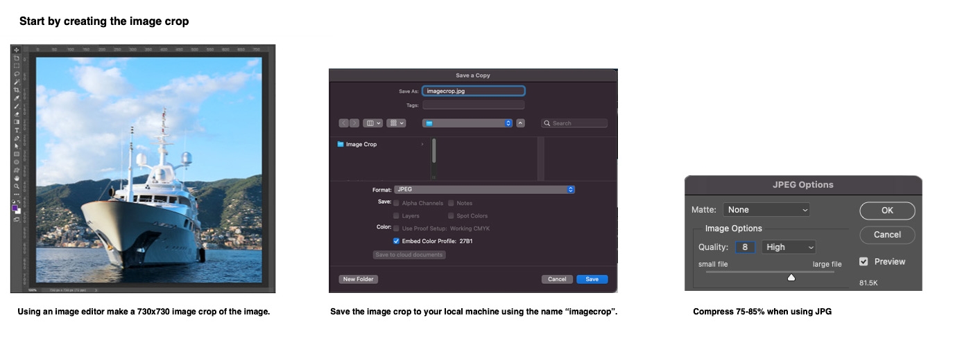
 Example shown of creating the correct Image Crop for use on mobile.
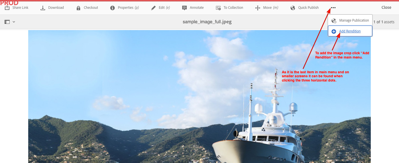
 Image Crop is done by making a square rendition of the desktop asset and then adding that rendition to the desktop asset itself using "Add Rendition" within Adobe AEM Assets
How it Works - We have custom code in AEM that looks for an image Rendition called exactly “imagecrop.jpg”. If it finds this Rendition, it will automatically display it on all devices with a screen width of less than 768 pixels. If it does not find a match, it will simply use a smaller version of the original image on smaller devices.
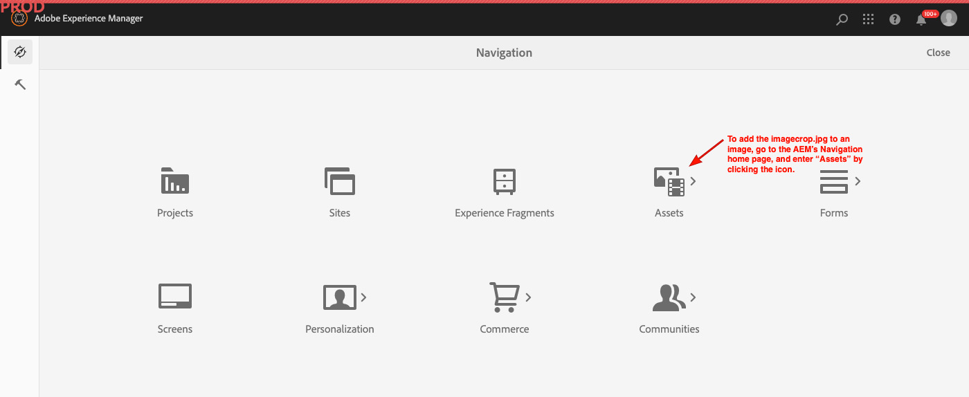
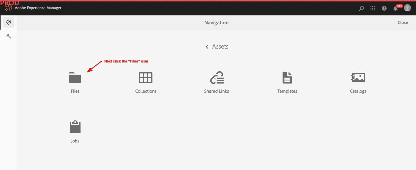
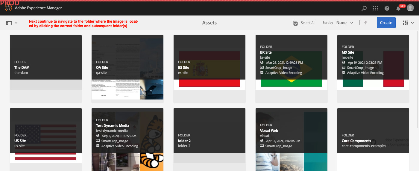
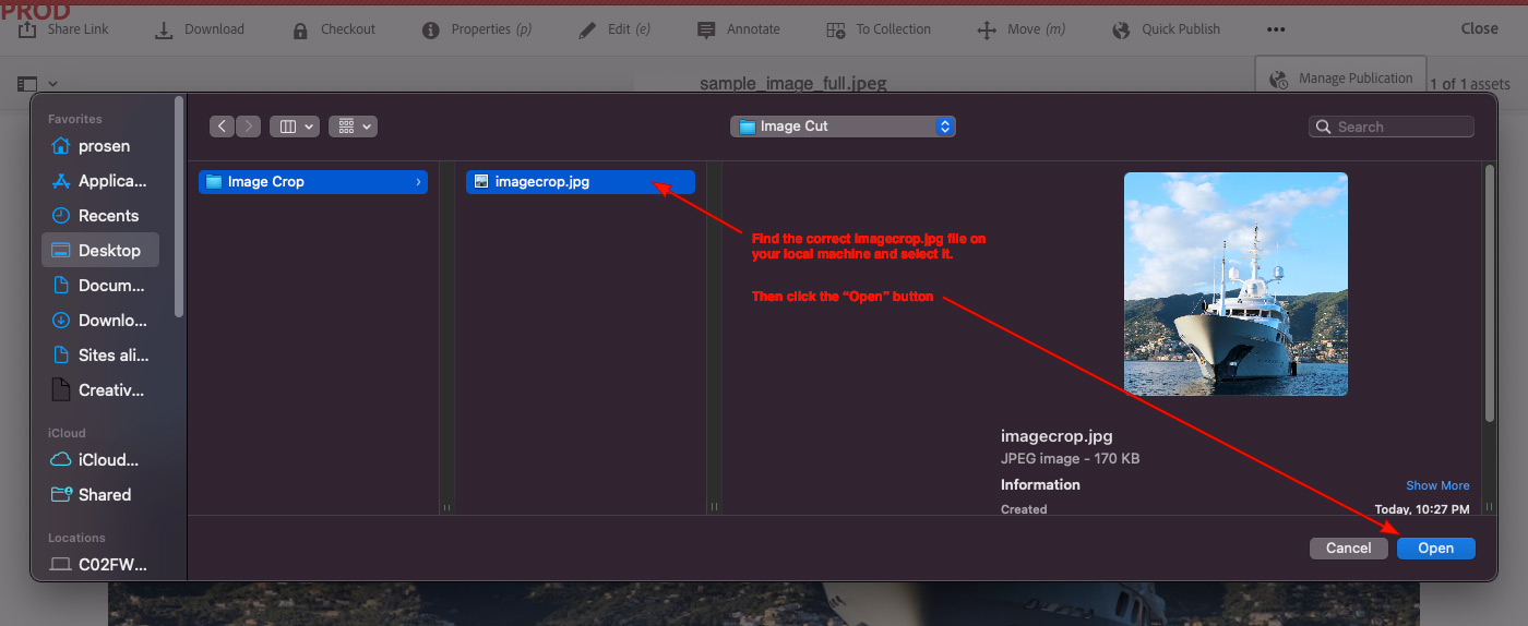
The next step is to add the imagecrop.jpg to the original image. There are two way to do this.
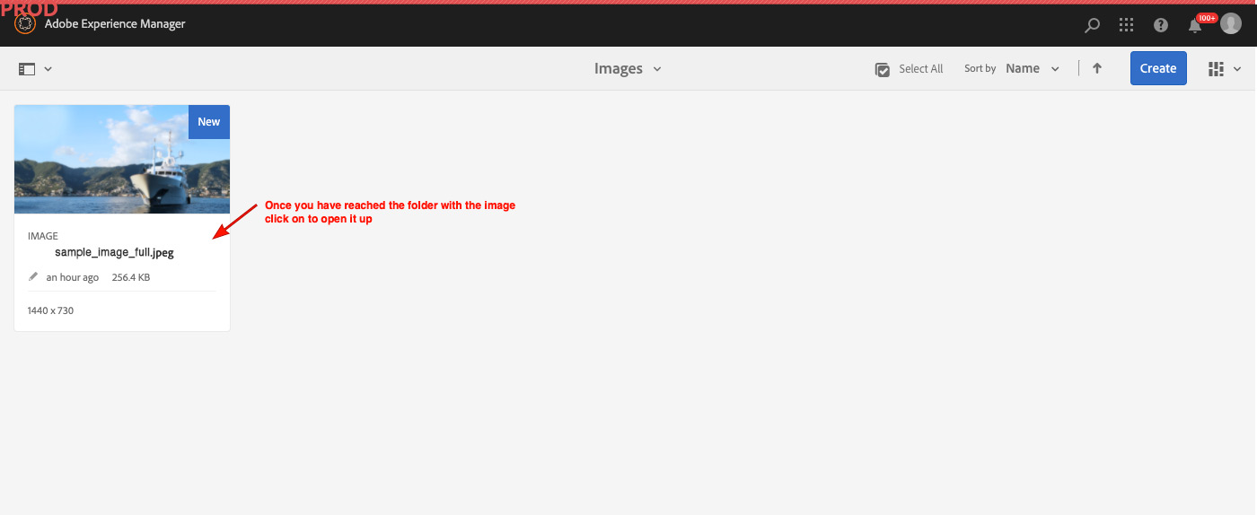
First, open up AEM and follow the steps below
Important: The file extension of your original image should be "jpg" (not "jpeg") or imagecrop may not work correctly.
 This is the final step and the image now has a 730x730 image rendition that should show up in mobile.
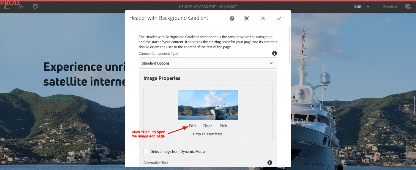
The second way is when the image is added to the component click the edit link under the thumbnail and that will open the image edit page.
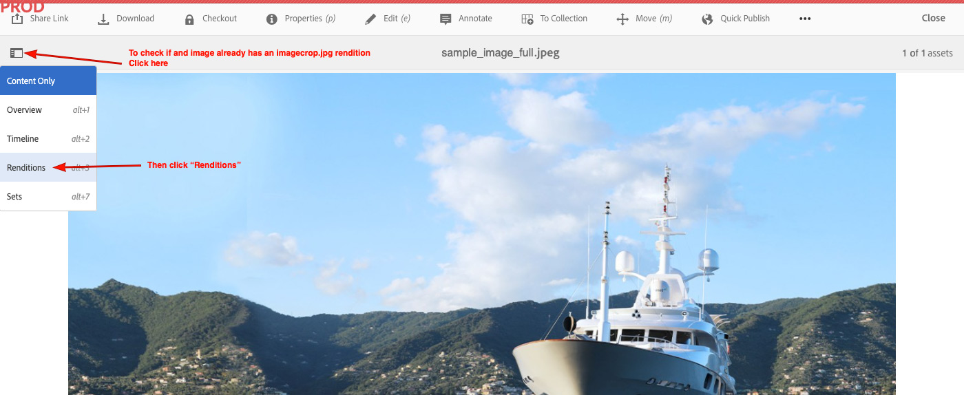
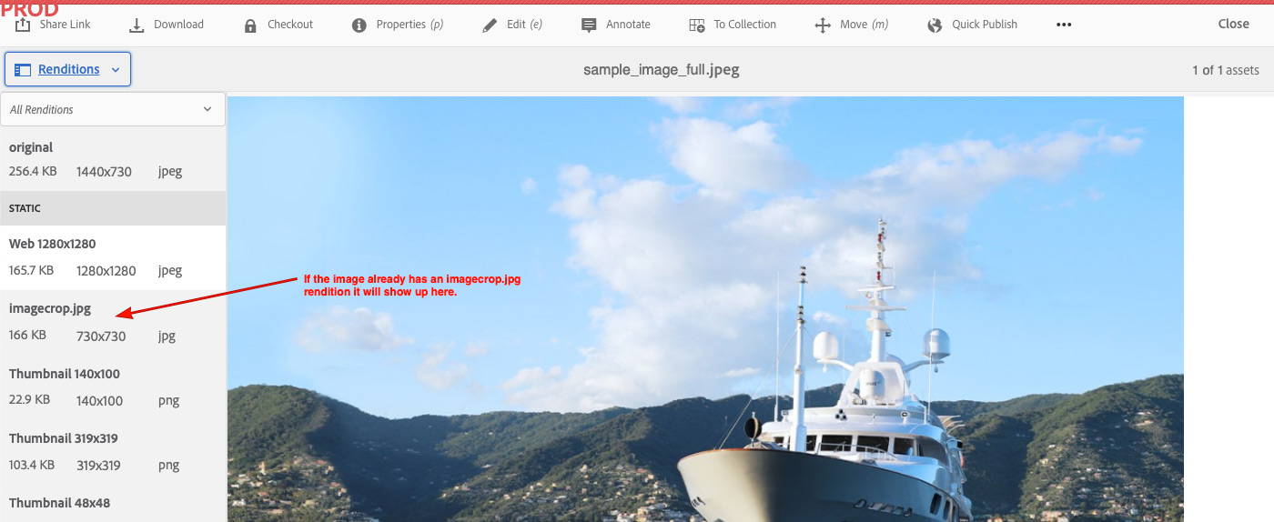
To check and see if an image already has and imagecop.jpg rendition. Go to image in assets and follow these steps
There are no Style Options for the Image Crop as it is a feature of AEM and not a component.
Follow the link below to return to all components.
