
The Standard "Hero Banner" component is the area between the navigation and the start of your content. It serves as the starting point for your page and its contents should orient the user to the content of the rest of the page. This component is a requirement of all "Overview" pages on Viasat.com and contains the H1 Headline which benefits site SEO and overall page quality score.
 Specifications for the Hero Banner, all of its elements, and the background image size.
Below are screenshots and authoring notes regarding the authoring of The Hero Banner component. Authoring notes are found in red text on the screenshots and below images as captions.
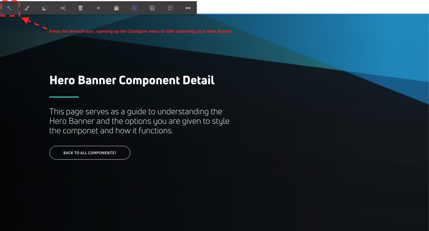 Start authoring the Hero Banner by selecting the Wrench icon which will bring up the Configure menu.
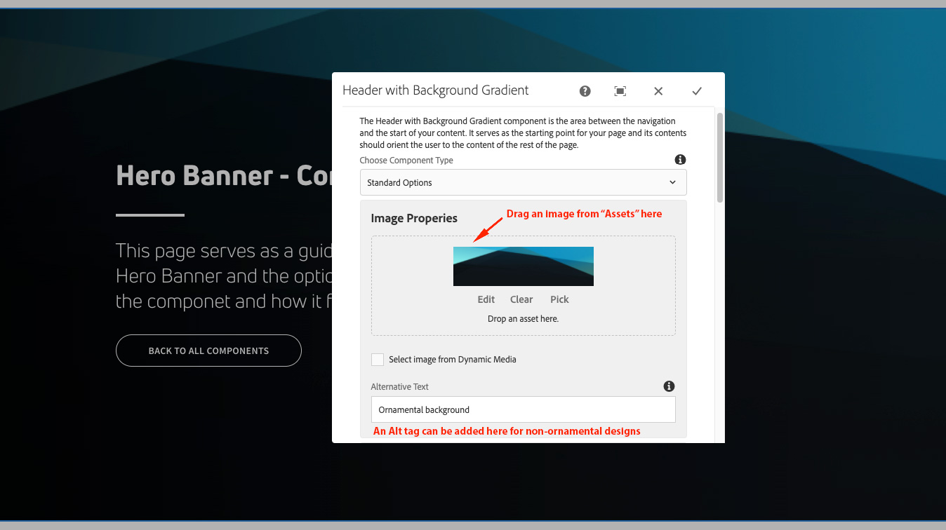 Selecting a background image asset and using Alt Text.
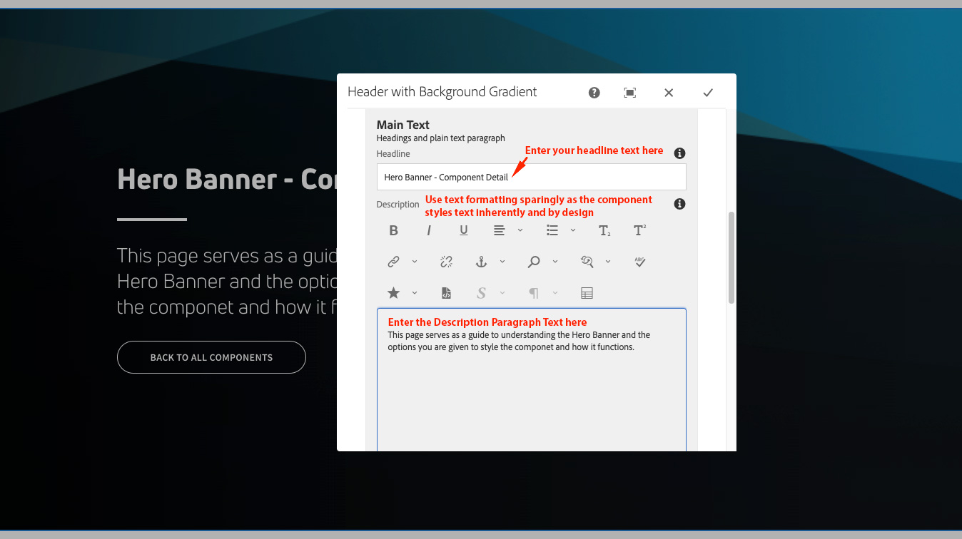 Entering the Headline and Description paragraph text and considerations on text formatting.
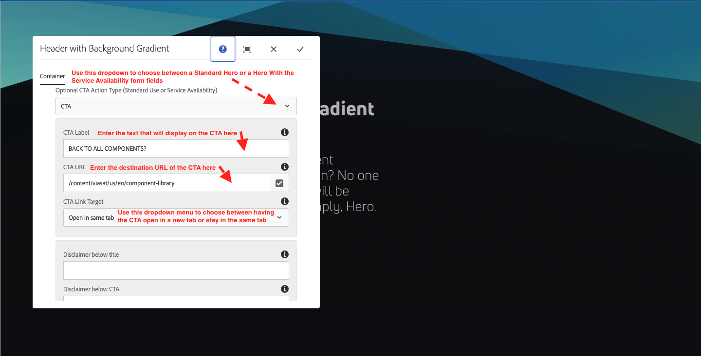 Choosing a Hero type (Standard or Service Availability), CTA labels, and CTA destination URL. NOTE: "Service Availability" is only used with the intent to sell a customer service.
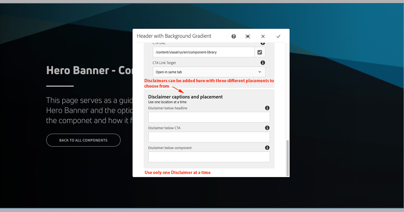 Using Disclaimers within a Hero Banner. Choose from three different Disclaimer placements.
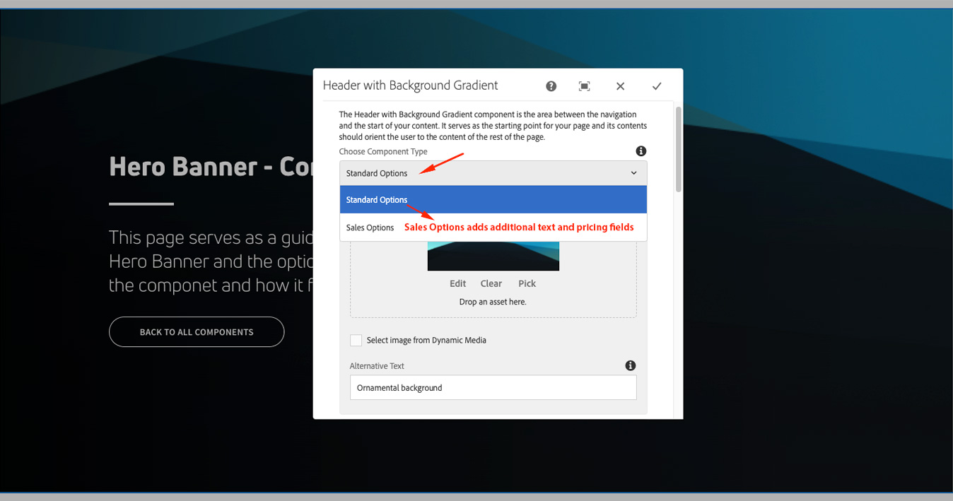 This "Sales Options" dropdown activates additional sales related fields. Most instances of this component use "Standard Options".
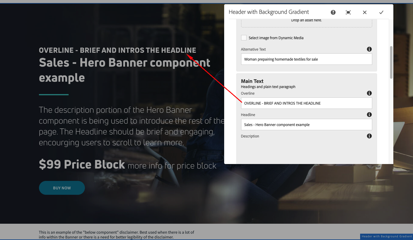 One of the additional Sales fields is the "Overline" text above the headline.
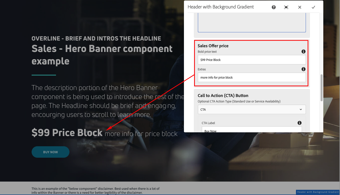 The "Price" text and "Extras" options for Sales appear like this.
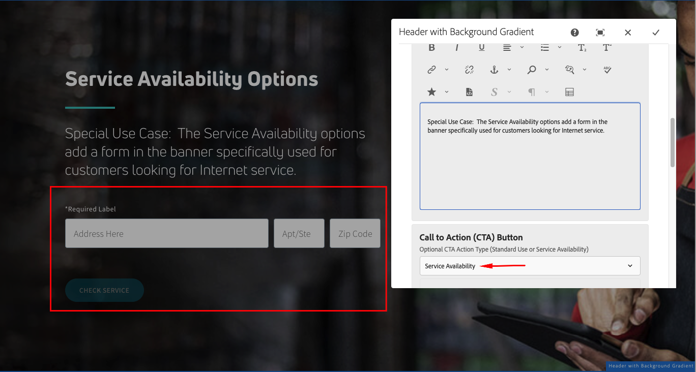 Selecting "Service Availability" in this dropdown adds the form as shown here. This is used for pages relating to customers looking for Internet service.
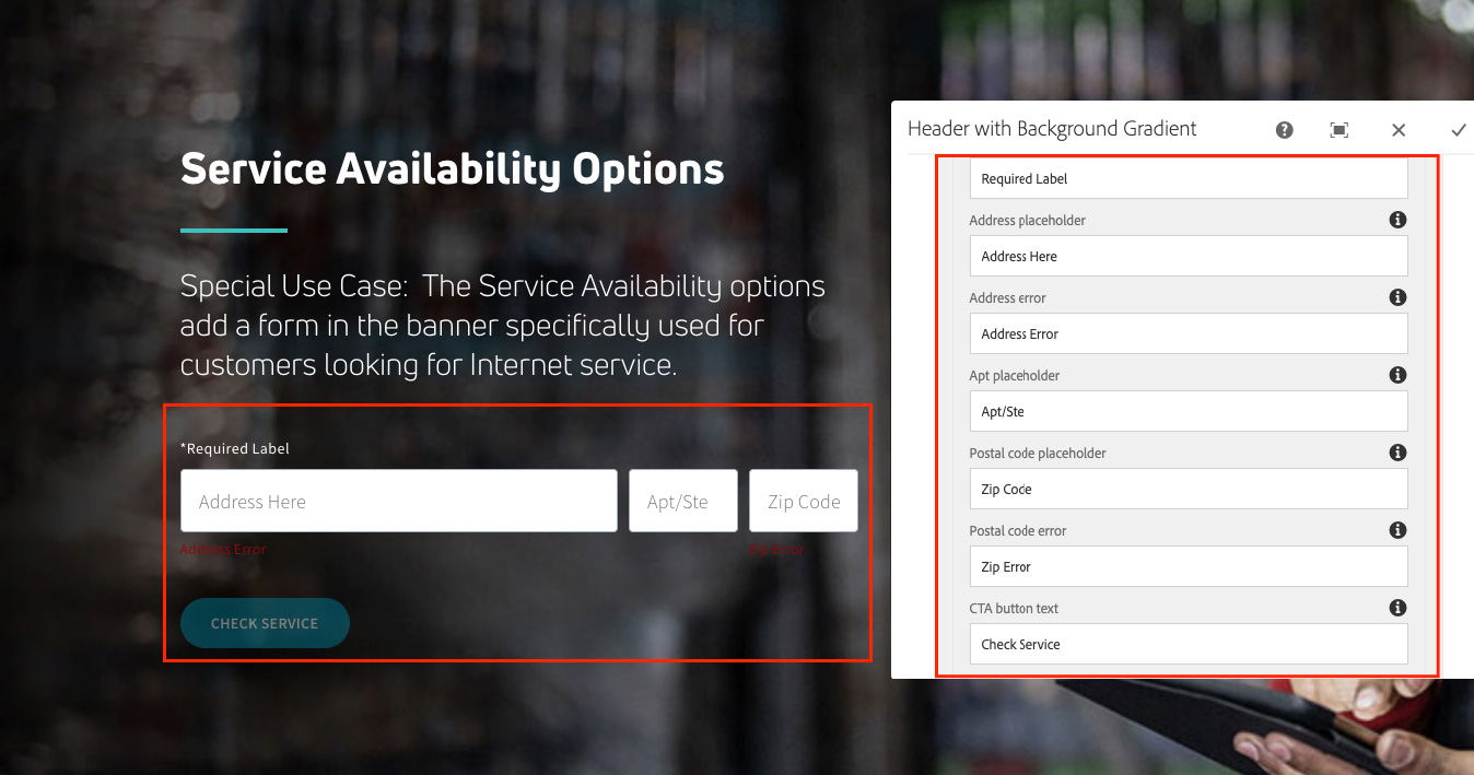 After choosing "Service Availability", additional fields appear to populate the form information.
The Paintbrush "Styles" icon allows you to make visual changes to your hero component including:
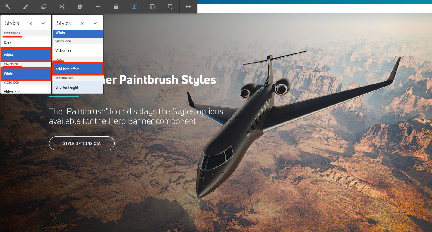 Showing the Styles Menu, displayed by clicking on the "Paintbrush" Icon.
For viewing and reference only.

The description portion of the Hero Banner component is being used to introduce the rest of the page. The Headline should be brief and engaging, encourging users to scroll to learn more.
The Disclaimer section can be used to display legal disclaimers. There are three different placements for the disclaimer, but only one should be used at time unless there is a legal reason to use multiple locations.
The description portion of the Hero Banner component is being used to introduce the rest of the page. The Headline should be brief and engaging, encourging users to scroll to learn more.
$99 Price Block more info for price blockThis is an example of the "below component" disclaimer. Best used when there is a lot of info within the Banner or there is a need for better legibility of the disclaimer.

This is a live example of the Shortened Height version of the Hero Banner. It's dimensions at Desktop are 1440x400px. Best used when you want Users to get to body content sooner.
Special Use Case: The Service Availability options add a form in the banner specifically used for customers looking for Internet service.
Follow the link below to return to all components.
