
The Flyout component appears as a tab on the right side of the screen in all views. Clicking/tapping on the tab makes the Flyout slide out of the right side, replacing the tab.
The Flyout is an alternative to the Floating Card and gives authors a chance to add promotional links, contact information, and Calls-to-Action within the Flyout area.
Part of its purpose is to be an ever-present link that scrolls with the user.
 This screen shows the Flyout tab "closed" on the right side of the screen. Tapping/clicking it will open it up, displaying the contents within.
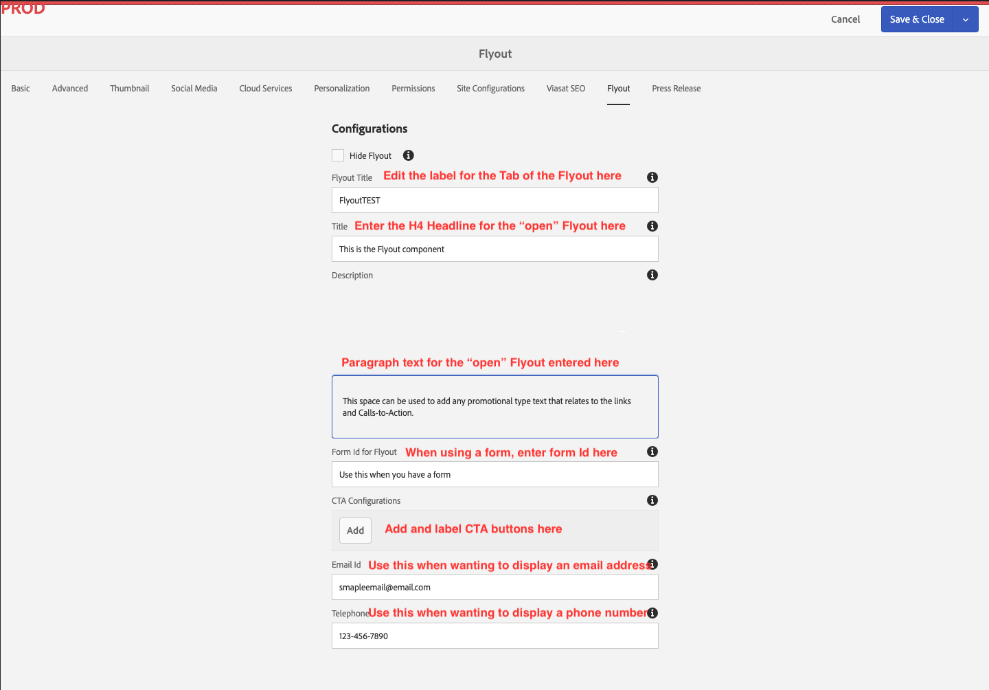
 The "Open" Fylout. 1) H4 Headline 2) Paragraph text 3) CTA H6 headline text labels 4) CTAs text label 5) displaying an email address and phone number with icons
Below are screenshots and authoring notes regarding the authoring of The Hero Banner component. Authoring notes are found in red text on the screenshots and below images as captions.
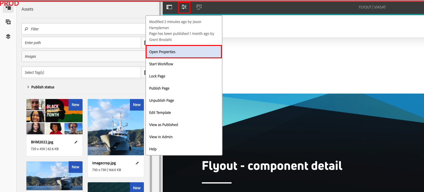 The Flyout settings are managed under Page Properties. Go here to access.
 Enable and configure the Flyout by selecting "Properties" on the page that you'd like to add a Flyout to.
The Flyout component is added and configured by using the "Flyout" tab when clicking the "properties" button within Adobe AEM when your page is selected.
Unlike most components, you won't configure the Flyout on the page you are authoring, but rather by using the "properties" button when selecting the page you'd like to add a Flyout to in the Adobe AEM site directory.
You'll find the Flyout tab on the right side of this page. Clicking/tapping on the tab will open up the Flyout. Within, you'll find the different elements you can add to the flyout. A user can exit the Flyout by clicking/tapping the "x" or anywhere outside of the opened Flyout.
Follow the link below to return to all components.
