
Flexible Image Card - component detail
This page serves as a guide to understanding the Flexible Image Card component. It is similar to the Universal Cards, but is more flexible.
This page serves as a guide to understanding the Flexible Image Card component. It is similar to the Universal Cards, but is more flexible.
The Flexible Image Card allows authors to use multiple lengths of text while having matching heights to the cards. The Flexible Image Card works in groups of two and three and will will match up the hieght of each card dependant on the tallest card. In order for any group of cards to work correctly, you must position cards within a Container component with the "Beta Flexible Card Container" class applied.

Coming soon.
 Flexible Image Cards in a Container component. Note the uniform height of the cards.
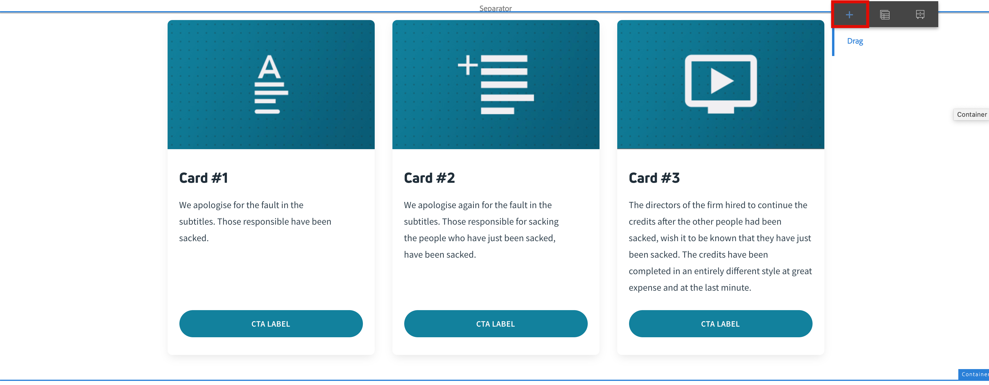 Insert Flexible Image Card by clicking the "+" button above the word "Drag". Note there is a rendering issue that is currently being resolved (hence the component labeled "beta").
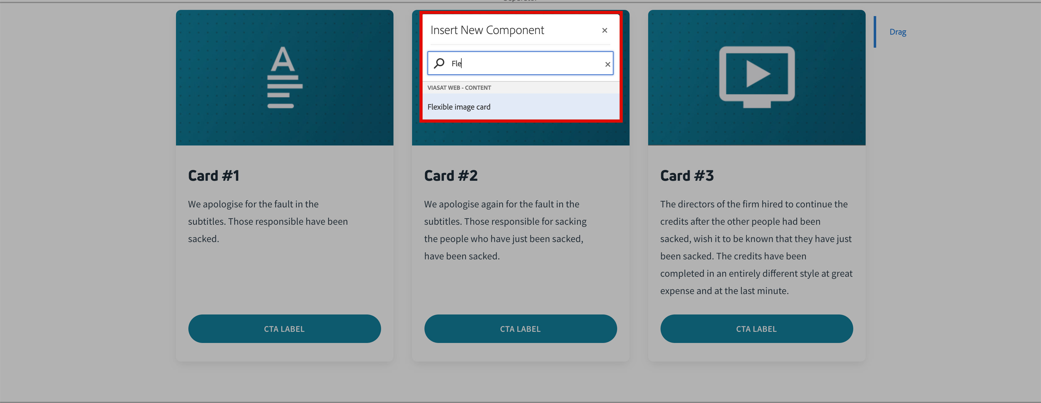 Search for and select "Flexible Image Card".
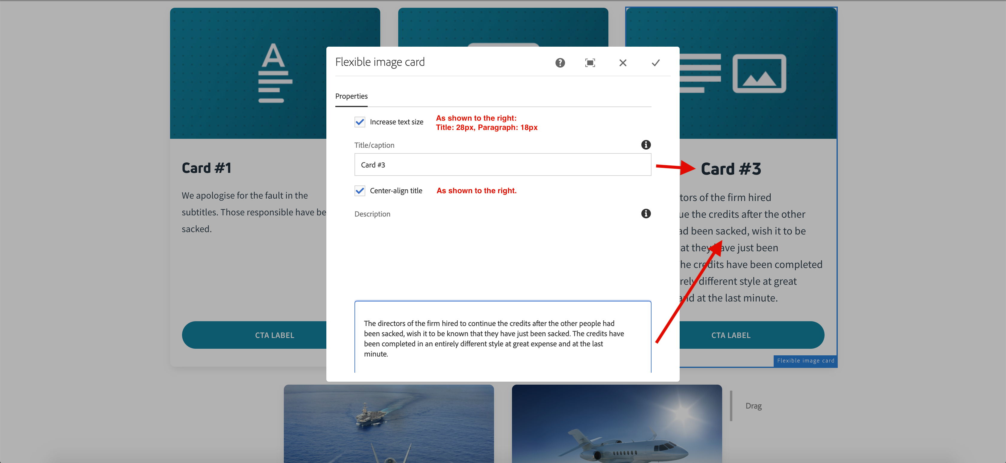
Style options are to be used sparingly as it is important to keep the text hierarchy of this component together. More details to be added in version two.
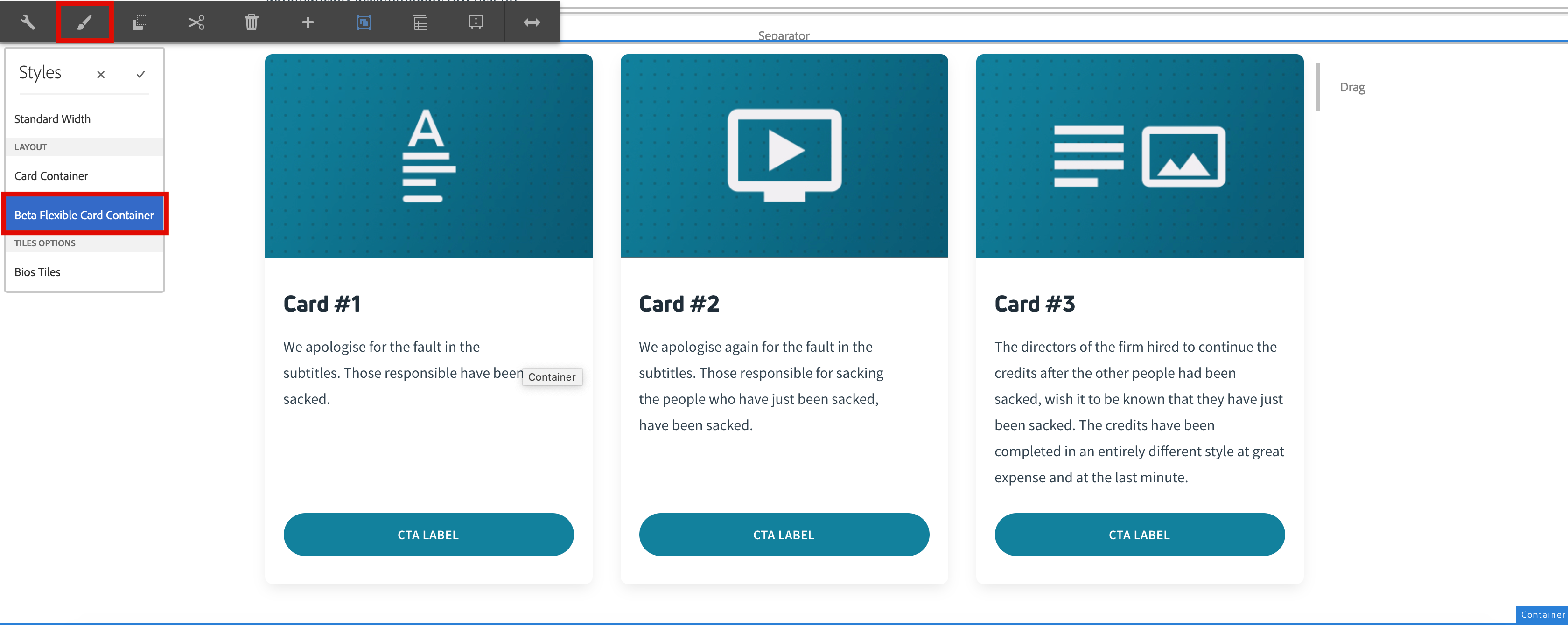 The Container component should have "Beta Flexible Card Container" selected.
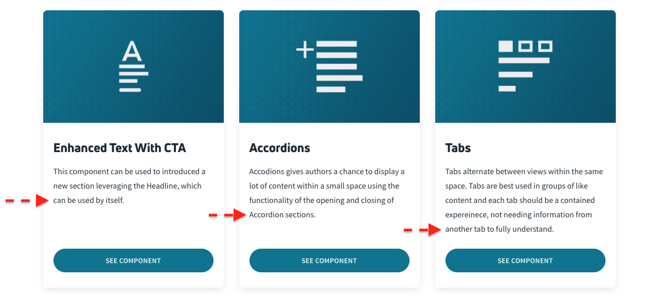
Below is an example of the Flexible Image Cards. For demonstration purposes, we have mixed and matched several options to showcase how these cards automatically accommodate row height.

We apologise for the fault in the
subtitles. Those responsible have been
sacked.

We apologise again for the fault in the
subtitles. Those responsible for sacking
the people who have just been sacked,
have been sacked.

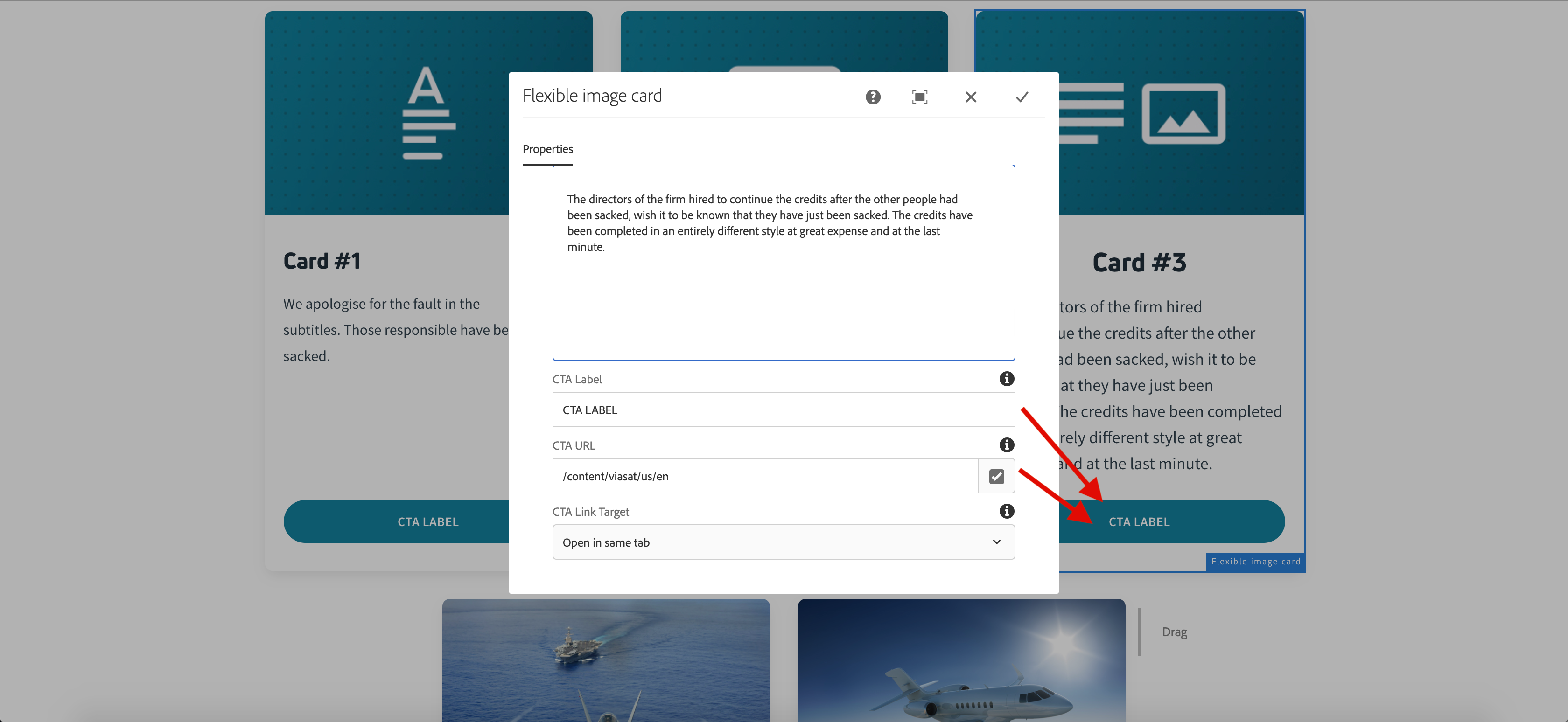
The directors of the firm hired to continue the credits after the other people had been sacked, wish it to be known that they have just been sacked. The credits have been completed in an entirely different style at great expense and at the last minute.
Follow the link below to return to all components.
