
Downloadable Carousel - Component Detail
This page serves as a guide to understanding how the Downloadable Carousel is authored and when it is often used.
This page serves as a guide to understanding how the Downloadable Carousel is authored and when it is often used.
The Downloadable Carousel Component gives authors the chance to show downloadable content such as datasheets, brouchers and white papers in a more visually interesting way.
PDFs are the most common type of asset used within this component, but it can also suppoert images and videos. The type of file is shown visual by the icon in the corner (PDF in this example) and will show a thumbnail within the card when using a video or image asset.
Since file size of the asset is automatically added to a card when the asset is entered. In the below example, the PDF featured in the card is 2 MB in file size.
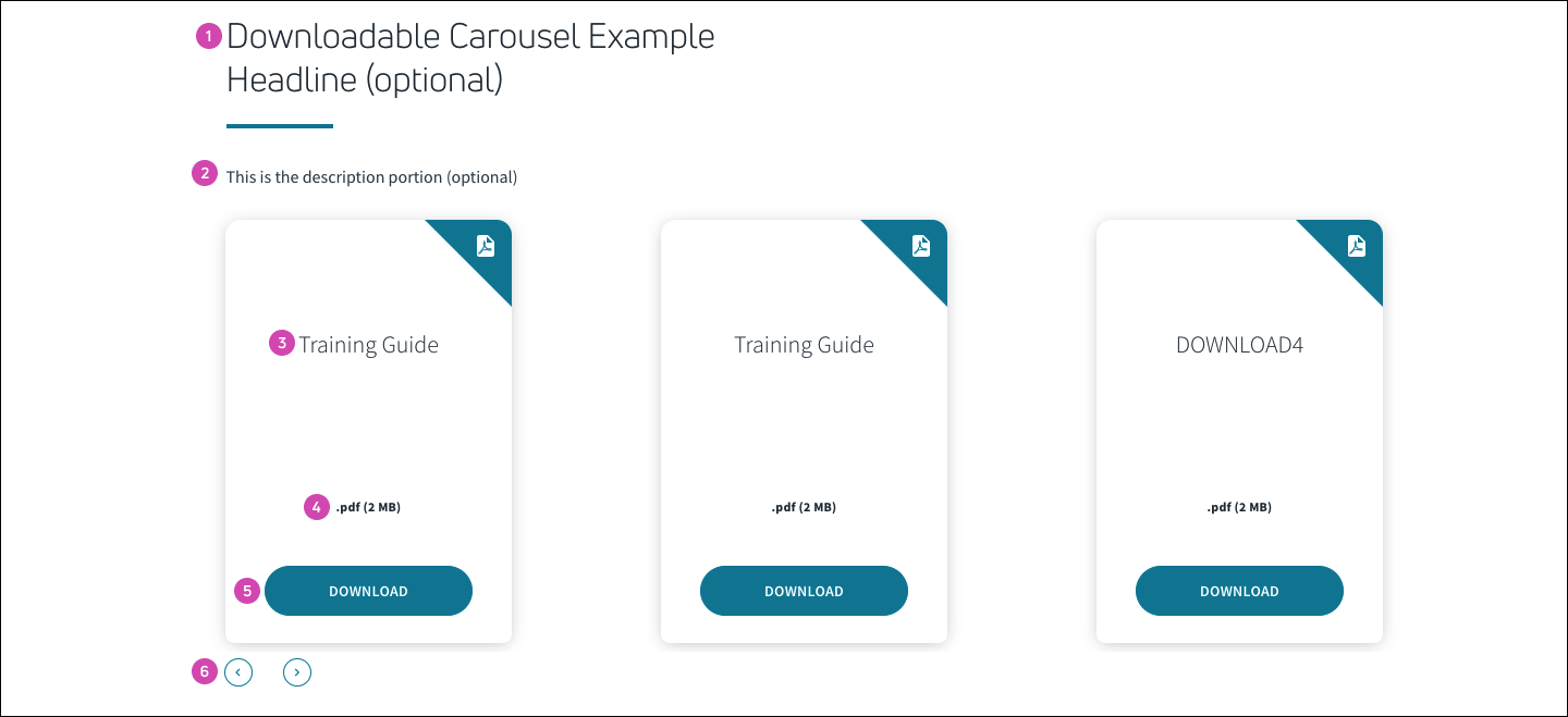 1) Optional Headline to intro Carousel 2) Optional description text 3) Title for PDF/File 4) File size for PDF(automatically added) 5)Download CTA 6) arrows when there are 4+ cards
Once a Downloadable Carousel is placed, you can then change the order of the cards and also add additional cards.
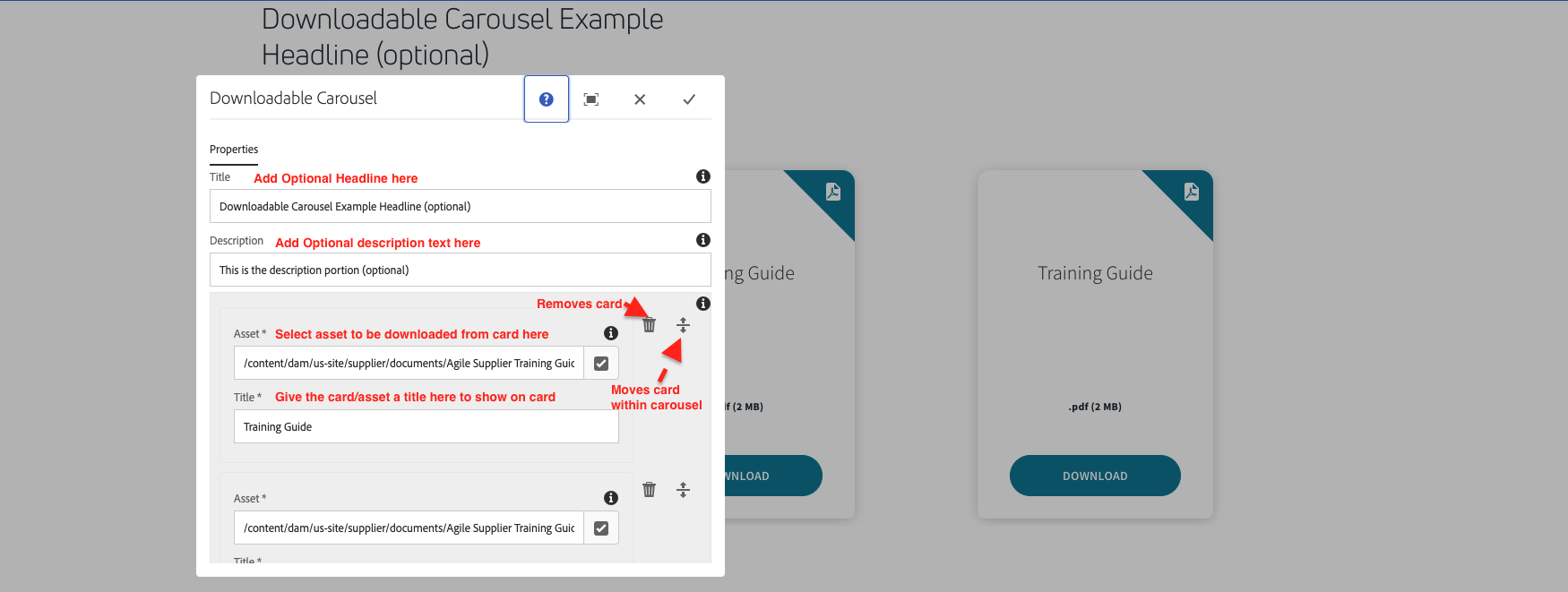 The first steps in authoring a Downloadable Carousel
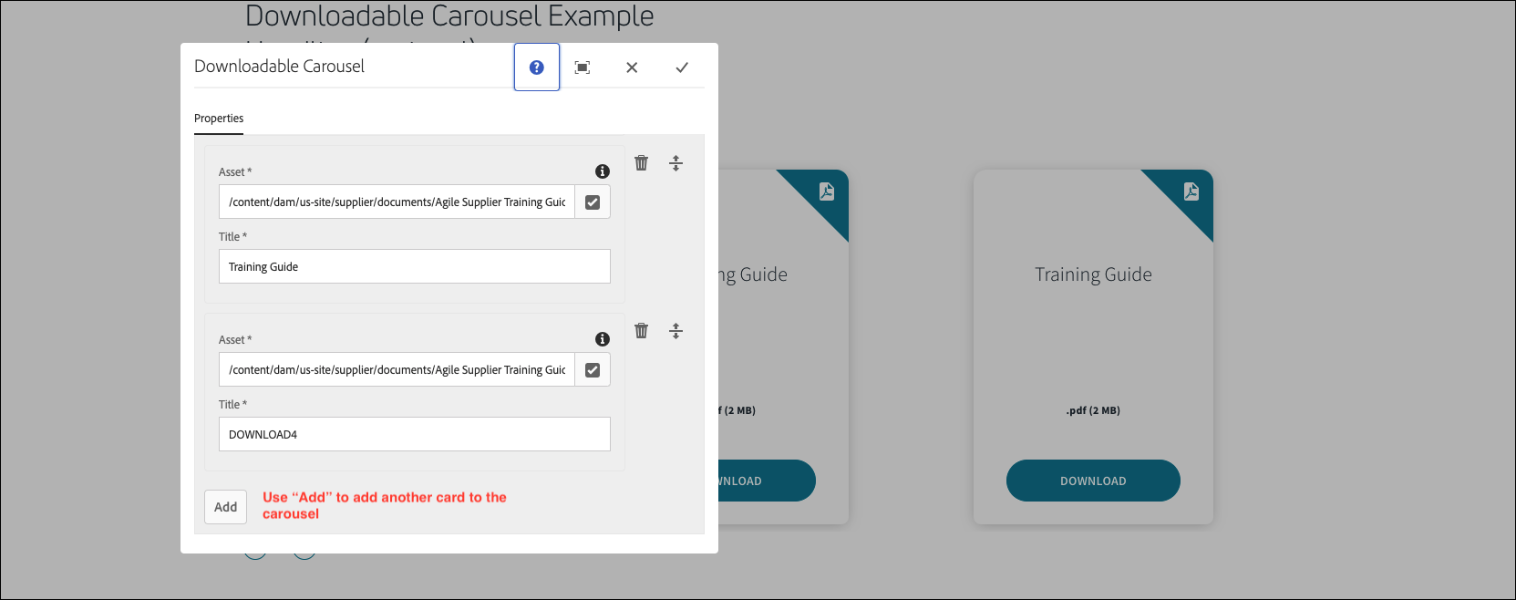 Using the "Add" button to add an additional card to the carousel
Below is an live example of the component being used in AEM. Feel free to click around the component and use the arrow controls to see how the component behaves. In smaller viewports the amount of cards dispayed at once may change, but the functionality of the card carousel stays the same.
This is the description portion (optional)
This example shows how images and videos can be used as downloadable assets within this component.

.png (1 MB)

.mp4 (58 MB)
Follow the link below to return to all components.
