
Containers
This page serves as a guide to understanding containers and how they help format and layout pages on viasat.com
This page serves as a guide to understanding containers and how they help format and layout pages on viasat.com
Containers help to layout and format web pages built for Viasat.com using Adobe AEM.
Some containers are inherent and included on the specific page templates used and some containers are specific to certain components that will reside within the container.
A list of Components that require (or do not require) Containers may be found here: AEM Components and Containers (PDF)
 This is an example of the root container. This is the default container for the template which all other components and subsequent containers will be placed within.
 Adding a unique Section ID to a Container. Please contact the Viasat.com Web Team when needing to add a unique Section ID to a Container.
Screenshots of the container authoring experience below. Authoring notes are found in red text on the screenshots and below images as captions.
A list of Components that require (or do not require) Containers may be found here: AEM Components and Containers (PDF)
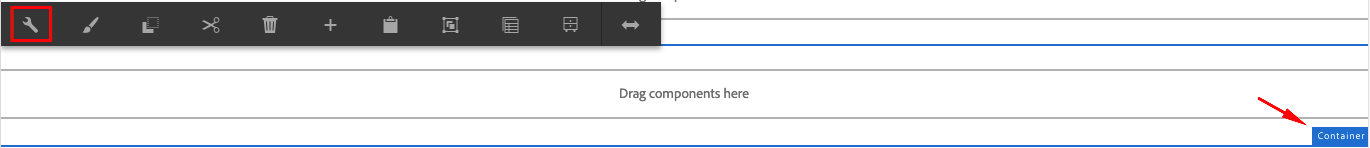 Containers are the primary building block in AEM. Use the wrench icon to view settings.
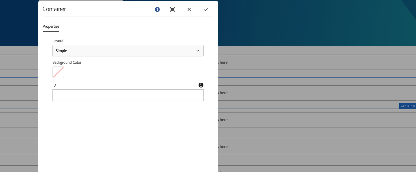 These settings should not be changed. The way Containers behave is handled by custom code and Paintbrush (Style) settings.
Some containers have style options that change how they behave. For advanced users and scenarios, a section ID can be assigned to a container. Please reach out to the Viasat Web Team if there is a need to assign section IDs to a container.
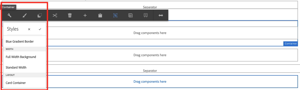 The many ways to style a container: Full Width Background, Standard Width, and Card Container.
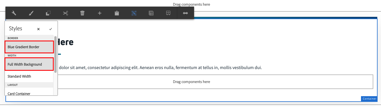 The Blue Gradient Border adds a colored top border to the container. This option is rarely used on the website. It should be used with Full Width Background also selected.
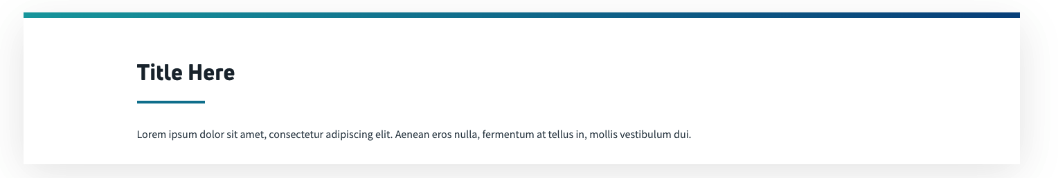 This is how the blue gradient option looks.
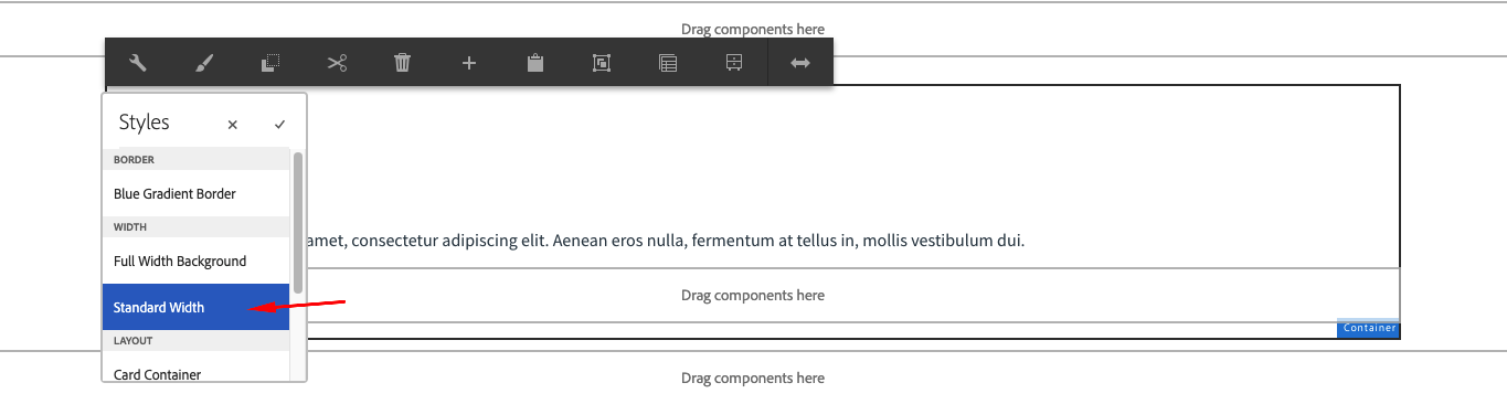 Standard Width is frequently used on Containers. This makes sure the content width is contained and consistent on a page.
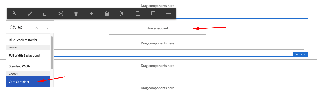 This specialized container is used for Cards. It organizes and spaces the cards appropriately. Only add Card type components into this.
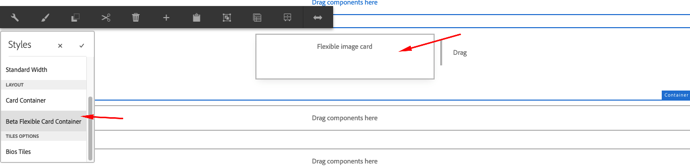 This specialized container is used for Flexible Image Cards. This type of cards is currently under development (beta testing only).
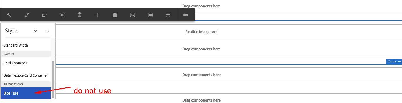 This container is used exclusively on select pages. For Development only. Do not use.
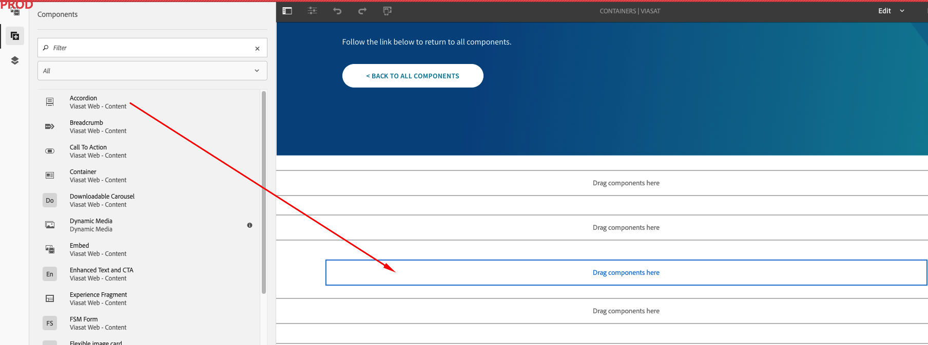 There are two ways to add components into a container. You may drag the component from the left pane onto the container as shown.
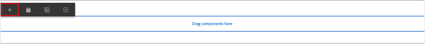 Or you may use the Plus icon on the menu to add a component into the container.
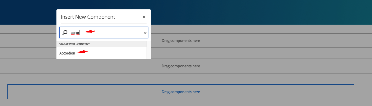 Tip: Use Search to find the component, e.g. Accordion, you are looking for.
Containers are a part of every page on Viasat.com. These are displayed and shown on the authoring URL by a blue outline and label. You can also see how your page is structured using the Content Tree icon on the far left panel, during the authoring experience in Adobe AEM.

Follow the link below to return to all components.
